Assignments
Pirate Party
Pirate Party will be due Dec. 18
In Pirate Party, we’ll learn how to make links within an html page – you click on a link in the page and it goes to another part of the page.
Here is a step-by-step handout for the assignment. It contains a grading rubric.
Here are the materials you need to do the assignment.
Creating a Gallery with SimpleViewer – Exercise
In this exercise, we’ll use Simpleviewer to create a web gallery. There are two ways to use Simpleviewer:
- Download and install the simpleviewer freeware from http://simpleviewer.net.
- Use the version bundled with Adobe Bridge.
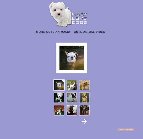
We’ll use method 2 to create a gallery of adorable puppy photos.
This exercise will be worth 21 points:
- Create Gallery (5)
- Insert gallery into web page (5)
- Make it look pretty much like Must Love Dogs screenshot (10)
- Upload to folder (1)
Styling Link States with CSS – Exercise
Handout here.
Assignment materials here .
This will be due on Dec. 4 (but you’ll probably get it done in class on the 20th, because you’re smarties).
In this exercise, we’ll practice using CSS to make links change when hovered over with a mouse. The handout explains everything in detail, so I won’t go on and on here.
Don’t forget to define a site!
Portfolio/Brochure – Last Big Assignment
Dec. 18 Deadline: Site is due at beginning of class – we’ll have a crit.
For your third website assignment, you will create either:
- a multi-page site based on a brochure.
- a multi-page personal portfolio site.
Student Examples
Brochure creative brief
A company has asked you to build a web site for them. They have given you a brochure and want you to create something using the same design.
They want a multi-page website that is easy to navigate and relates to the brochure. No matter how bad the brochure looks, create a multipage web site containing all of
the information on the brochure.
Use the colors and fonts from the brochure in your web site in order to keep the same look and feel, however, feel free to update it for the web.
Brochure guidelines
- Choose any brochure or informational material.
- Scan images and graphics from the brochure into the computer.
- Use the same color scheme and the same or similar fonts.
- Minimum of four pages.
- Must have a usable navigation scheme that is persistent on all pages.
- Must have contact page with simple form (I’ll give you more information on this later).
- You will be awarded points for using the techniques we’ve learned so far (tables, animations, rollovers, etc) with good judgement.
- CSS – the entire web site must get its fonts and colors from either an external style sheet, internal style sheet, or both.
Personal Portfolio Creative Brief
Create a portfolio web site for your work. This web site should have at a minimum 4 pages:
- main page,
- a portfolio page,
- a contact page, and
- a resume page.
Your site should be aesthetically cohesive, and should have a usable navigation scheme that is persistent on all pages. All your pages should include the details and design elements that you’d expect to find on a quality portfolio site.
Portfolio Guidelines
- Choose instances of your work that you’d like to show to prospective employers.
- Digitize them by scanning, or by converting to jpegs.
- Come up with a page design template that coordinates with your logo and stationery.
- Must have contact page with simple form (I’ll give you more information on this later).
- You will be awarded points for using the techniques we’ve learned so far (tables, animations, rollovers, etc) with good judgement.
- Â CSS – The entire web site must get its fonts and colors from either an external style sheet, internal style sheet, or both.
Project timeline
- Nov. 20 Tue – Work night for Portfolio Brochure. Also, CSS Links in-class assignment
- Nov. 27 Tue – Work on Brochure/Portfolio Site. I’ll be gone and you’ll have a sub.
- Nov. 29 Thurs–
- Interim deadline for B/P site – Photoshop/Illustrator/Fireworks prototype of your site ready for a crit. If you don’t have some kind of a draft ready to show, your final grade will be lowered 10 points.
- SimpleViewer demo – learn how to make an image gallery with Bridge • Dec. 4 Tue – Brief discussion of web forms + work night
- Dec. 6 Thurs – Pirate Party (anchored Links and Image Maps) demo + work night
- Dec. 11 Tue – Work night. Also, brief discussion of tables.
- Dec. 13 Tue – Work night
- Dec. 18 Tue – Portfolio/Brochure crit. Last class. All work must be in on this day.
Dane County Farmers Market
Here’s a link to the materials you’ll need for the assignment: DCFM_Materials.
Here’s a link to the handout: DCFM Handout.
Here’s a link to the grading rubric: DCFM Grading.
Here’s a link to the Plan Like a Turtle worksheet: Plan Like a Turtle Worksheet.
Interim due date: Nov. 6 – see details below in project timeline.
Due date: Nov 15 at the beginning of class.
Student examples:
Create a web site for the Dane County Farmers Market
- Your site will have four pages, a home page with three secondary pages.
- Text for all pages is provided.
- You can choose from the two provided logos.
- This project is worth 100 points.
Project requirements:
- To begin your creative process using brainstorming, outlining and sketching techniques,
- To create a tight prototype of your site using Photoshop or Illustrator,
- To slice and optimize the prototype in the program of your choice, and then to lay out the site using CSS,
- To create a consistent graphic look throughout the whole site, and
- To use the copy provided.
- All copy, with the exception of logo, decorative text and headlines will be html.
- Do not add or remove logo elements, or change the font in the logo.
Project Timeline:
- Oct 25 – In class, we will discuss the project, brainstorming and wireframing. We will start gathering source materials for the assignment.
- Oct 30 – In class, we will work on creating a site prototype and on wireframing. (Also, intro to Dreamweaver)
- Nov 1 – Work day. (Also, we’ll talk about making absolutely positioned divs and other CSS rules with Dreamweaver.)
- Nov 6 - Interim deadline and crit- you’ll need to show three things: sketches, wireframes and a Photoshop/Illustrator prototype. If you don’t have these items ready, your final grade will be lowered 10 points.
- Nov 8 – Work day. (Also, review of some spans and divs.)
- Nov 13 – Work day. (Also, I’ll show you how to make web forms – both the easy way and the hard way.)
- Nov 15 – Project due at beginning of class.
Temporary Home Page (+ extra credit)
Due date for extra-credit enhancements – Tuesday, Dec. 18
Here’s a link to the handout: Temporary Home Page handout
Make a home page for your folder on caweb. How much you do is up to you.
What it must have by Oct. 30:
- Working links to all your assignments (3 pts)
- Must work as the index page to your directory. In other words, when I click on your name in the list, this page must appear. (6 pts)
- One image (1 pts)
- Satisfactory design (5 pts)
- Valid code (5 pts)
If you add some fancy stuff, you can get extra credit! (due date for enhancement Dec. 18)
- Original images/illustrations used well – (10 pts)
- Semantic animation (in other words, animation that adds to the meaning and usability of the page (10 pts)
- Gratuitous but fun animation (5 pts)
- External style sheet –(5 pts)
- Floated layout – (20 pts)
- CSS link states –(5 pts)
- Image map – (10 pts)
- Design excellence (10 pts)
Bare-Bones Example
Fancied-up Examples
Artist/Musician Assignment – 100 points
Here’s a link to the materials you need for this assignment.
Here’s a link to the handout.
Due Date:Â October 25, 2012 at the beginning of class
Here are some examples of artist/musician sites:
YOU HAVE BEEN HIRED TO CREATE THE ART AND GRAPHICS ONLY FOR A SINGLE PAGE SITE.
An art director has already determined the layout of each page. Your job is to create the artwork to fit within the grid. It is crucial to the programmer/coder that you create graphics to exact sizes indicated on “map,†and use naming scheme as shown in two documents:
- Musician_map.pdf
- artist.html
OBJECTIVES
Explore using Photoshop and Illustrator and Dreamweaver to:
- create static comps for web pages;
- turn static comps into sliced and optimized images for use in a web page;
- create simple Javascript behaviors to enhance the interactivity of a web page;
- create gif animations.
GUIDELINES
MAIN ILLUSTRATION:
- Choose any entertainer, group, artist, author influential person past or present.
- You may use photos for illustration reference only. Any photos must be dramatically altered to be included.
- Illustration style is open. However, it should reflect the mood/personality of subject. For example, a nice peaceful pastel color portrait of Marilyn Manson would probably not be appropriate.
- Consider caricatures, satires, collages, found objects, non-literal interpretations. The only rule is that the illustration must bear some resemblance to your subject(s).
- Illustrations must be created to fit within layout.
NAVIGATIONAL BAR:
Could contain the following choices, and there must be at least three:
- Bio
- Influences
- Body of Work
- Photo Gallery
- Home
Prepare as one graphic to size. We’ll go over how to slice the nav graphic into separate buttons and how to make them change on hover in class.
BACK/NEXT BUTTONS:
The “back†and “next†elements must also be rollover buttons. You’ll prepare them using the same methods we learned preparing the nav buttons.
TITLE BAR:
Must contain the name of artist/group. Be creative. Consider warp and special effects features in Illustrator and photoshop and traditional media for creation. Font choice and colors are very important for consistency within page.
ANIMATION:
This is an accent graphic that should reflect something about the artist or group. For example, if you choose Elvis, your animation could be of a little swiveling pelvis.
OVERVIEW OF TASKS
- Choose artist and gather images
- Using Photoshop, create a static comp of your artist page.
- Slice up the comp into the required areas: titlebar, navi, etc. Slicing, BTW, is a Photoshop term that means cutting up a comp,
- Optimize each slice appropriately for the web. We will cover slicing and optimizing thoroughly.
- Open the Artist.html page from the materials folder in TextWrangler. Save it as your Artist webpage. In this html page, place the images you created in the slice/optimize process in their correct divs.
- Returning to the ani slice, we’ll make a gif animation using Photoshop.
- Returning to the navi and back and next slices, we’ll make rollover animations using Photoshop.
- We’ll plug the ani, navi, and back/next slices into their areas.
- W00T! We’re done! Time for the crit.
The 100K Scuba Optimizing Assignment
In this assignment you are given some text and some graphics files. Your job is to make a multipage web site out of these files. You must use all of the graphics files and the site must be under 100K. Decide how large you want to make each of the images and what is the best way to compress them. (JPEG, GIF … )
You will need a number of files for this project.
I’ve put the files you’ll need in a zipped folder, which you can download here.
They are all PSD or Illustrator files so you will need to convert them.
Here’s a list of the files
PSD
- diver.psd
- sand_water.psd
- deepdown.psd
- fish2.psd
- beach.psd
Illustrator
- scubadiver
- scubaequipment
Text
- divertext.txt
This assignment will help you become more familiar with Adobe Photoshop and Illustrator.
You will be graded on these criteria:
- Code Structure (paired tags – html, head, title, body, etc.) – 5 points
- Alignment of text and graphics on page; overall placement of images and text; color choices of text and background – 3 points
- Use of all 7 images supplies – 7 points
- Optimized all images appropriately – 3 points
- Use of image source tag with attributes for all images – 2 points
Here are links to some sample pages:
A Simple Resume (20 points)
Due September 18 at the beginning of class. We’ll have a crit.
In this assigment, you have the task of recreating (or start from scratch) your resume as an html document. Consider organizing everything into a multi-page web site that is user friendly. However, if you want to make it just one page, that’s ok.
You will be graded on these criteria:
- Code Structure (paired tags – html, head, title, body, etc.) – 5 points
- Alignment of text and graphics on page; overall placement of images
and text; color choices of text and background – 5 points - Content included appropriate content for a resume – 2 points
- Use of ordered or unordered lists for content – 3 points
- Use of CSS for styling body copy, background and lists – 4 points
- Use of email link & defined link states in CSS – 1 pt
Here are a couple of links to other students’ finished resumes:

