Announcements +
the occasional rant

Finishing up Farmer’s Market & a fancy full-page background demo (week 12)

Posted on: November 16th, 2012

Reading assignment for Tuesday, Nov. 20

Chapter 11: CSS Orientation pp. 214–223 Inheritance, etc.

Chapter 12: Formatting Text, pp. 244-260 ID selectors, class selectors, specificity

Chapter 14: Thinking Inside the Box ,pp. 305–335 Boxes, borders, drop shadows

Here’s what we did this week:

  1. On Tuesday, I demo’d how to make a background that stretches to fill the browser window.  If you want to do this, here is a video that shows you how: Full-Page Background Demo.
  2. On Thursday, I we had a work night and and then a crit of the completed Farmer’s Market sites.
  3. At the end of class on Thursday, I handed out stuff for our next (and last big) assignment – the Portfolio/Brochure site.

Schedule for the rest of the semester

  • Nov. 20 Tue – Work night for Portfolio Brochure. Also, CSS Links in-class exercise
  • Nov. 27 Tue – Work on Brochure/Portfolio Site. I’ll be gone and you’ll have a sub.
  • Nov. 29 Thurs
    • Interim deadline for B/P site – Photoshop/Illustrator/Fireworks prototype of your site ready for a crit. If you don’t have some kind of a draft ready to show, your final grade will be lowered 10 points.
    • SimpleViewer demo – learn how to make an image gallery with Bridge
  • Dec. 4 Tuesday – Work night. Also, discussion of web forms and hosting, domain registration, etc.
  • Dec. 6 Thurs – Pirate Party (anchored Links and Image Maps) demo + work night
  • Dec. 11 Tue – Work night. Also, brief discussion of tables.
  • Dec. 13 Tue – Work night
  • Dec. 18 Tue – Portfolio/Brochure crit. Last class. All work must be in on this day.


Full-page background image

Posted on: November 13th, 2012

Want to make a full page background image that stretches to accommodate the browser window like this? Yes you do. Here’s how:

Add a Full-Page Background Image – 22 minutes from Ann Foley on Vimeo.

Usability + CSS in Dreamweaver (Week 11)

Posted on: November 11th, 2012

We talked about websites that are horrible, and that was fun because we can all come up with so many.

Here‘s a post with links to some great usability resources.

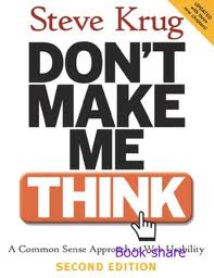
Don’t Make Me Think is the definitive book about usability, well worth a read. I think it has applications beyond digital design. Many designed items that you use every day – packaging, textbooks, other books, phones, instruction manuals – could stand a little usability testing.

Dreamweaver Demo screencast

We also started using Dreamweaver for CSS – both for layout and for styling text and so forth. Below are links to screencasts I made from my Thursday night demo.

  1. Layout with Dreamweaver part 1 – 6 minutes. Overview of project plus the most important part of working on a site in Dreamweaver.
  2. Layout with Dreamweaver part 2  – 7 minutes. Creating the divs we’ll style later.
  3. Layout with Dreamweaver part 3 – 7:40 minutes. CSS in Dreamweaver; styling the wrapper div.
  4. Layout with Dreamweaver part 4 – 7 minutes. Styling the header div.
  5. Layout with Dreamweaver part 5 – 3 minutes. Styling the maincontent and sidebar divs.
  6. Layout with Dreamweaver part 6 – 13 minutes. Styling the text. Styling the links. Creating the border between maincontent and sidebar.

Dreamweaver, at long last (week 10)

Posted on: November 1st, 2012

We started using Dreamweaver, Adobe’s web design product, this week. Dreamweaver is really useful. It’s a text editor, a file manager and an FTP client (like Fetch) all in one.

But it can also be confusing – probably because it does so much. So we’ll take it slow.

We also started work on the Dane County Farmer’s Market assignment. We’ll have a preliminary crit on Tuesday, Nov. 6.

Here’s what you need to have ready on Tuesday. In a manila envelope:

  • Filled out worksheet with
  • 2 mood sketches
  • 2 wireframes

A preliminary Photoshop mockup of your home page for the site. This should be printed out.


 Also, please bring two examples of web sites, or features of websites, that drive you crazy.


Links and How to Make Them (week 9 recap)

Posted on: October 29th, 2012

Sorry this recap of last week is a little late, students. To refresh your memory of last week (only Thursday the 25th – no class on the 23rd):

  • Critiqued the Musician assignment. You all did a fantastic job! I truly am impressed by the results I saw.
  • Practiced making links. To assist you, I’ve put a Links Cheatsheet in the Handy Tips section. It includes info about how to make links to files in higher directories, if you want to experiment with that.
  • We did the Temporary Home Page assignment. The bare bones version of this is due Tomorrow.

See you tomorrow!

ps – I made a video: Link to an External Style Sheet. It’s also on the Handy Tips page.

Rant Archives